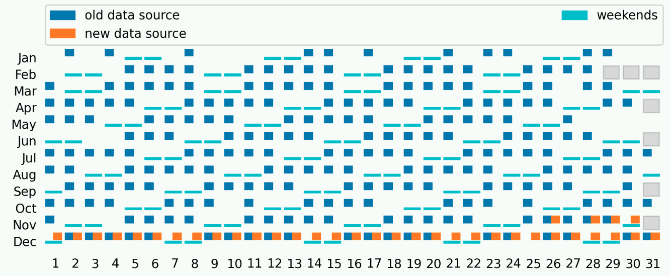
Though somewhat strange I happen to come to a need of having a plot of dates that a particular dataset is available on. Doing my exploration in Jupyter notebook it just felt pretty natural to have it written in Python and generated as a graph, with matplotlib.
This resulted in a visually appealing description of the dataset. Also, due to the ease of change, I could modify the plot to show additional elements. Although adding more and more, it started to look weirdly confusing, with the need of legend, more insight into it, etc.
But nevertheless, this kind of graph still seems pretty useful to show 2-5 boolean-type information per day.
Here’s the sneak peek into what the code below produces:

Now for a short description of how this is done.
First we need some data points. In my case I was just listing a directory on S3 share:
Was running that in a notebook, that’s the reason for strange syntax with asterisk. The resulting variable’s contents were:
I wanted to reformat that data a bit. Especially since every directory had internally multiple files and depending what kind of files there were - I wanted to have that fact reflected on the plot:
Main motivation here is to get appropriate data format in
available_dates_with_details . This snippet shows how the data is
formatted:
And now the real meat - plotting the dataset:
All this functions and data need to be glued together. This snippet does exactly that: